Thursday, November 29, 2012
Playing with Bristol Board
Our next step was to make some transformations with bristol board. It has many different qualities than paper, most notably having multiple layers. In this way, it's good to play with different thicknesses of the paper. I feel as though leaving all of it solid makes it too dense and too plain. While it is time consuming to peel back different layers, the end result is most definitely worth it seeing as it looks incredible with a light behind it. I plan to use this feature in my final lantern. Below are the bristol board transformations I played with. My favorites, and the ones I plan to continue on with after getting feedback thursday, include the tiled one, the zig zag one near the top of the picture, and the crumbled one with long, narrow, triangular strips crossing in the bottom right. I am excited to see what direction will look the best.

Tuesday, November 27, 2012
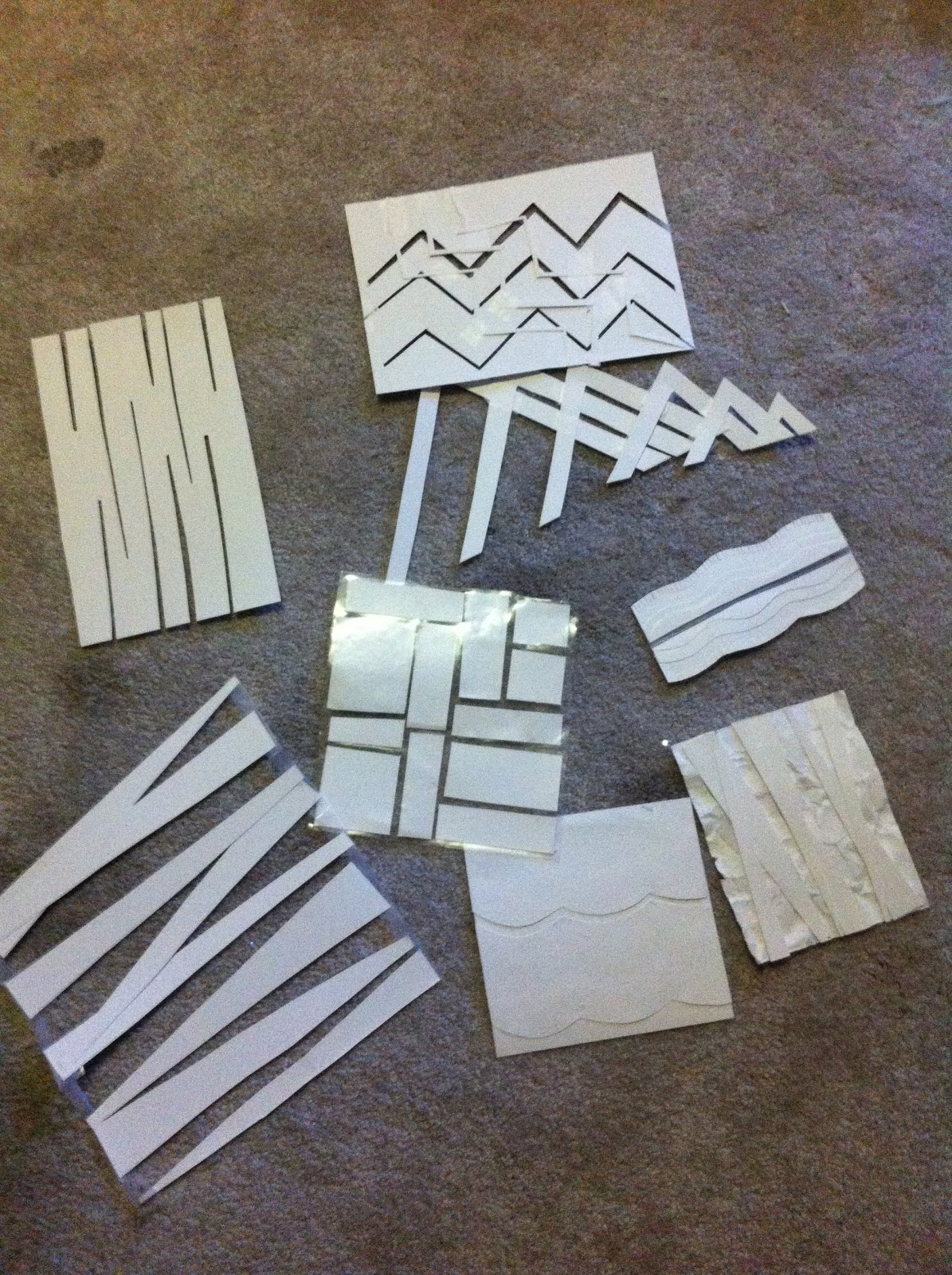
Paper Transformations
Last week, we were instructed to play with paper and work with it - see what it can do. You could cut, tear, crumble, wet, etc. in order to transform its appearance. This helped to get our juices flowing for the lantern project to sort of get an idea of the direction we want to potentially go with it. I posted below a picture of the different things I tried. I am still very unsure of which pattern my lamp will be based around, if any, but I still have much more time to decide that.


Wednesday, November 21, 2012
Photography Essay Reflection
This was a rather short, yet extremely valuable and informative essay. After reading it I feel as though I could go take some professional-looking pictures. It consisted of eight sections of tips for photography. The first was symmetry & asymmetry. This is rather self-explanatory but both can be useful depending upon the subject matter.
The next section was repetition. It was explained that repetition can be very useful in getting across an expressive effect in a photograph. It’s the concept that one would be cool, but multiple really force that point across and grab ones attention.
Following this section was one on framing. This one stuck me the most I would say since it’s not something that I would normally think of, yet it is essential. Having other objects that not only lead to the main subject, but also contribute to understanding the photo are quintessential. It’s something one assumes to occur naturally, but it takes much planning on the photographers part.
Close-ups were discussed next. These are usually used to take a snapshot of objects typically overlooked. This close up view calls for your attention to a certain aspect. Opportunities for these photos appear everywhere and are readily available.
Continuous mode is yet another aspect to consider. If you take photos in a circle and get motion shots you can either great a book out of it, or you are bound to get a photograph that you love out of the multiple. It’s a good option for subjects that are in motion.
Also essential to the photograph process is exploration. You’re never going to absolutely love your first design idea, and much is the same for photographs. The author suggests taking a hundred photos beforehand with different lighting and shadows to find something you really like and can work with.
Movement is another option when photographing. If you move the lens while the photograph is in process, the result is typically very neat. It is usually hard to make out what it is, but the abstract picture is a piece of art.
Last, but certainly not least, is serendipity. The author told a story of the light fuse going out in a coffee shop and he therefore got a photo op of candles in the bathroom. The lesson here is to always have your camera with you for you never know when an opportunity might arise.
Even though I am not a photo media major, this information has been very helpful to me and I’m glad to have taken the time to read it.
Monday, November 19, 2012
Parts of the Letter Reflection
At the beginning of our project Daniel gave a presentation on the parts of the letter. It was extremely informative. We learned all about x-height, which is what the ascender and desenders are measured off of, along with cap heights, baselines and more. It really taught me a lot about what all goes into these fonts. Before I didn’t even know what ‘serif’ was but now am informed about every little mark and its title. It was extremely helpful for this project especially. Fonts is actually one of my favorite things to work with. In drawing class, I typically opt to draw lyrics in fun fonts rather than anything else. This is probably why I enjoyed this project so much.
As for learning about these fonts, it really helped us decide what font to use for the project. We had an option whether or not we used a serif font, and opted out of it since we feel as though it did nothing for our word. This was good to know and to think about so that our form turned out exactly as we had wanted and how we had it planned.
A lot more goes into any project than one would expect, and this was just one of those times. It wouldn’t seem as though learning about the parts of letters and their labels would help out for creating meaning in a physical word, yet it definitely played it’s part. Overall, I’m glad I now have this information for future reference and future projects.
“By learning the vocabulary designers and typographers can develop a greater understanding and sensitivity to the visual harmony and complexity of the alphabet.”
Tuesday, November 13, 2012
Refined Book Model
Today we were instructed to bring in a refined version of our book and were then given critique. After today I have determined that I need to make it a little smaller, make the cover red, make sure all the photos are the same size, and print out the backgrounds as all one piece rather than cut/paste. I have posted a few pictures of my model below:


Monday, November 12, 2012
Preliminary Photo Books
Last Thursday we were instructed to bring 3 examples of potential photo books. Here are a few pictures of the ones I made:


In the end, with the help of both my teacher and peers, I decided to go with the last on for a little bit of a different approach.
Friday, November 9, 2012
Word Placement
Yesterday we were finally able to all get together to put our words around campus in create places. It feels good to have it done, especially since the tape started losing the adhesive. I hope you like them!


Tuesday, November 6, 2012
Finished Word Model!
It has taken some intense work these past couple days but today was the day it all came to a close! Between meeting all day Sunday, and a lot longer Monday than was expected, our team was more than excited for it to be finished with our enormous letters. Today we set them up on Wescoe beach for our peers to see, using a pole to make the 'l' just as we had planned. We had a lot of trouble with getting the letters to stay upright considering how extreme the wind was today but all-in-all I think we are all very happy with our outcome :)


Saturday, November 3, 2012
Letter Construction
This past week has been focused all on creating our huge letters which will be set up around campus. I posted a picture of how our model will turn out in a past post and since then have been working on construction; it takes a lot longer than one would expect. We plan to meet tomorrow to complete the model seeing as it is due on Tuesday. As soon as it is all glued/taped together we plan to paint it red in which I am responsible to getting so we have to figure out which paint will work the best. I am anxious as to see how it will turn out.

Subscribe to:
Posts (Atom)